
Institutional Red
Hex: #b30838
RGB: 179, 8, 56
HSB: 343, 96%, 70%
Pantone: 201 C
CMYK: 0,100,63,29


At Ripon College, institutional branding usage means applying the college’s visual and verbal identity consistently across ripon.edu, admissions materials, social media, signage, and alumni communications, so that every touchpoint reinforces the same recognizable identity. This includes following approved guidelines for the Ripon logo and wordmark, official color palette, typography, and tone of voice, whether that’s on academic department pages, athletics content, or student organization materials. Because a liberal arts college’s reputation is closely tied to how it presents its academics, history, and community, careful brand governance helps ensure that content across the site and beyond stays polished and unified. This also matters for practical web maintenance work like auditing pages, fixing broken links, or coordinating with teams like Alumni and Admissions, since consistent branding keeps the user experience professional even as many different contributors add or update content.




Red is the primary color or Ripon College, followed by the blue and cyan colors. Cream should be used primarily as a background color.

Hex: #b30838
RGB: 179, 8, 56
HSB: 343, 96%, 70%
Pantone: 201 C
CMYK: 0,100,63,29

Hex: #002d74
RGB: 0, 45, 116
HSB: 217, 100%, 45%
Pantone: 288 C
CMYK: 100,87,27,19

Hex: #7ca7ad
RGB: 124, 167, 173
HSB: 187, 28%, 68%
Pantone: 5493 C
CMYK: 100,87,27,19

Hex: #f5f2ed
RGB: 124, 167, 173
HSB: 245, 242, 237
CMYK: 3,3,5,0
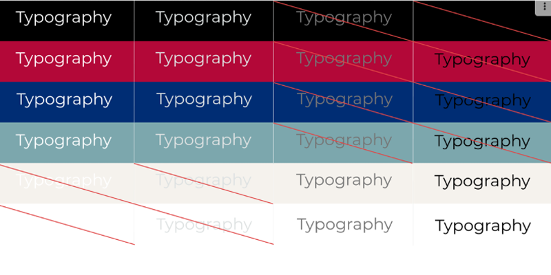
For visual contrast and to adhere to accessibility standards, please consider the following when selecting text color and background colors.
Don’t use Institution Red on dark backgrounds

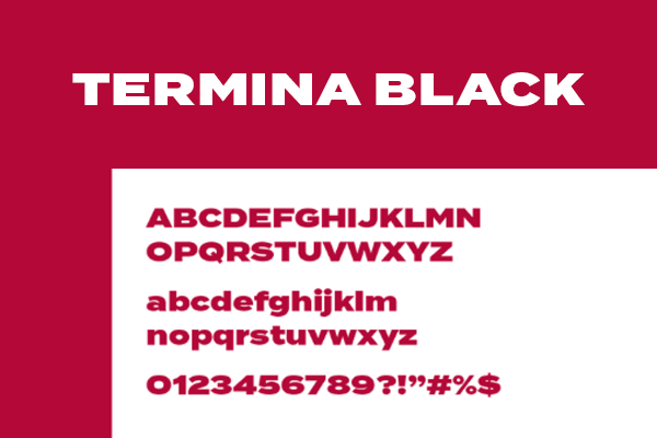
Termina Black is the primary typeface used for all headlines and subheadlines. Headlines in Termina should always be use in all-caps.
Please note: If Termina Black is unavailable, we recommend using Archivo Black as the approved alternative primary typeface.
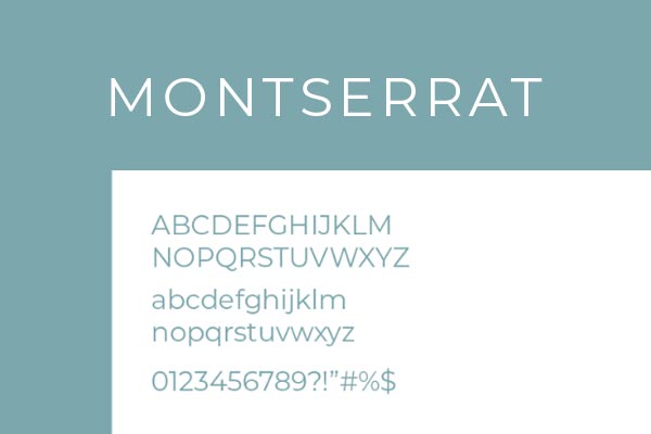
Montserrat is the secondary typeface used for all body copy.
Montserrat should use normal capitalization settings.
Photos of students or individuals in their element should be the main images used. Using close up action shots of individuals within collateral allows the viewer a glimpse into a Ripon College experience. These images feel more personal, genuine and impactful. We encourage the use of these images vs. building or landscape photography.


For secondary images, using a color wash overlay effect on images is part of the Ripon College visual identity system. This treatment is meant to help images become part of the background, not primary focal point and should be used primarily on images of buildings or general campus wide shots. The color overlay may be in any of the Ripon College primary colors.